Project Description:
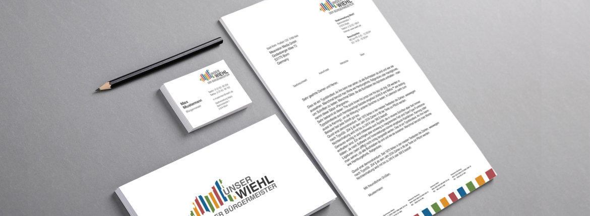
Within my portfolio, I am excited to showcase a corporate identity project I undertook for the German town of Wiehl. This comprehensive endeavor involved creating a distinctive visual identity that accurately represents the town's unique characteristics.
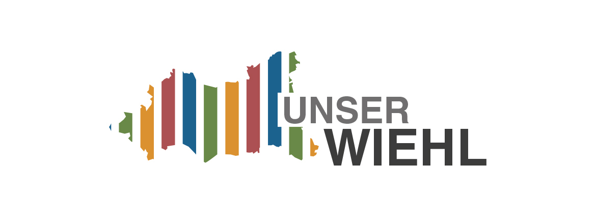
At the heart of the project is the logo, meticulously designed to reflect the city borders, symbolizing Wiehl's geographic identity. To further enhance the brand's visual impact, I incorporated colors that align with the local economy, such as green to signify tourism. This thoughtful color selection not only adds vibrancy to the visual identity but also establishes a meaningful connection to the town's economic focus.
Key Features:
- Comprehensive corporate identity: The project encompasses various elements, including the logo design and color scheme, which collectively form a cohesive and representative visual identity for Wiehl.
- Geographic symbolism: The logo's representation of the city borders serves as a distinctive and memorable element that embodies Wiehl's unique geographic identity.
- Strategic color palette: By selecting colors that align with the local economy, such as green for tourism, the visual identity establishes a strong connection to Wiehl's economic focus.
Through this corporate identity project, I effectively captured the essence of Wiehl, showcasing its distinctive features and economic strengths. The logo and color scheme work harmoniously to create a visually appealing and meaningful representation of the town's identity.

